
Photography Viewing Experience

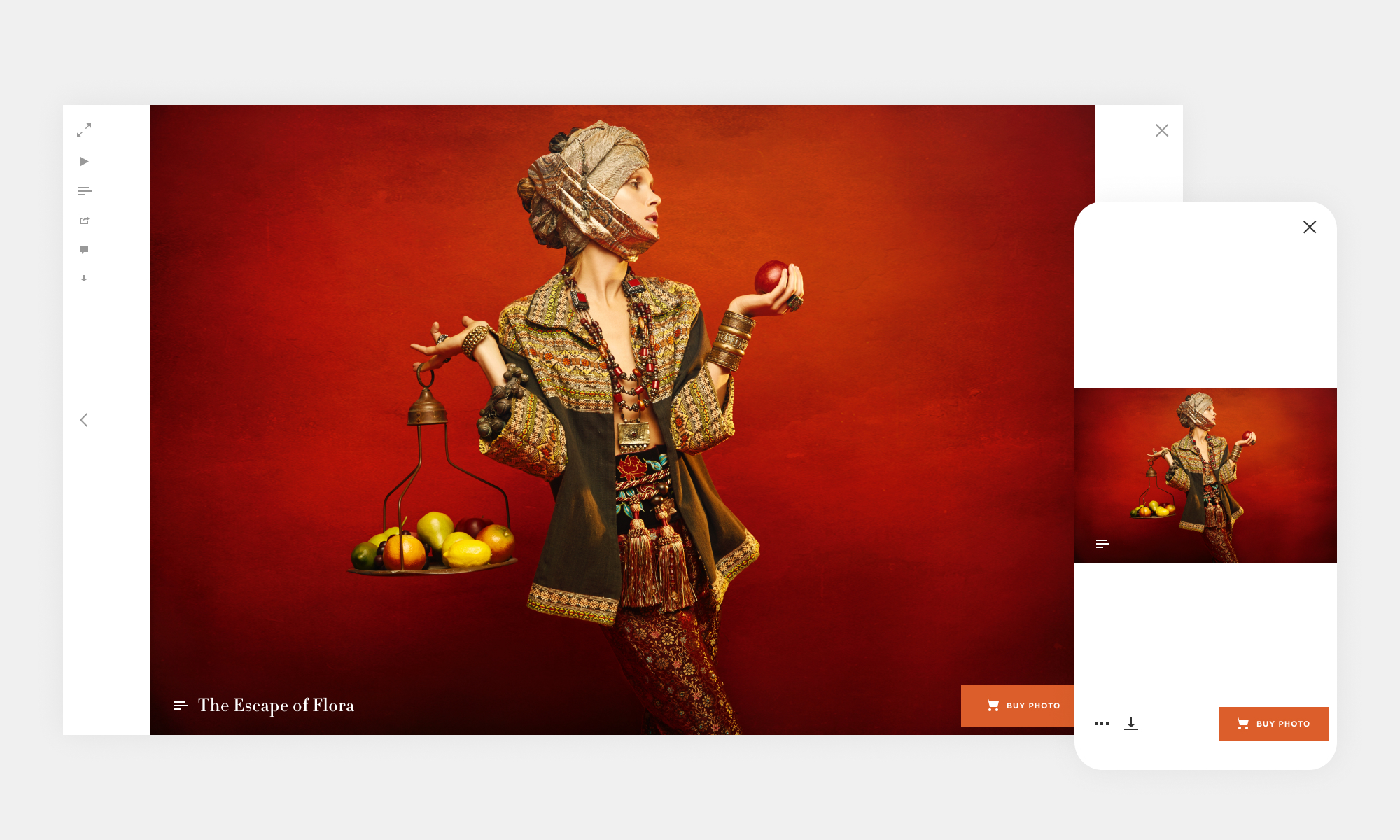
Fullscreen viewing experience displaying a standard 3:2 landscape photograph. Actions are places outside the photo to avoid clutter and distraction from the photography.

Standard 2:3 portrait photograph with desktop hover over icon and overflow action menu on mobile revealed. Most screens are 16:9 aspect ration and the new lightbox viewing experience takes advantage of the extra negative space to the left and right of the photo.
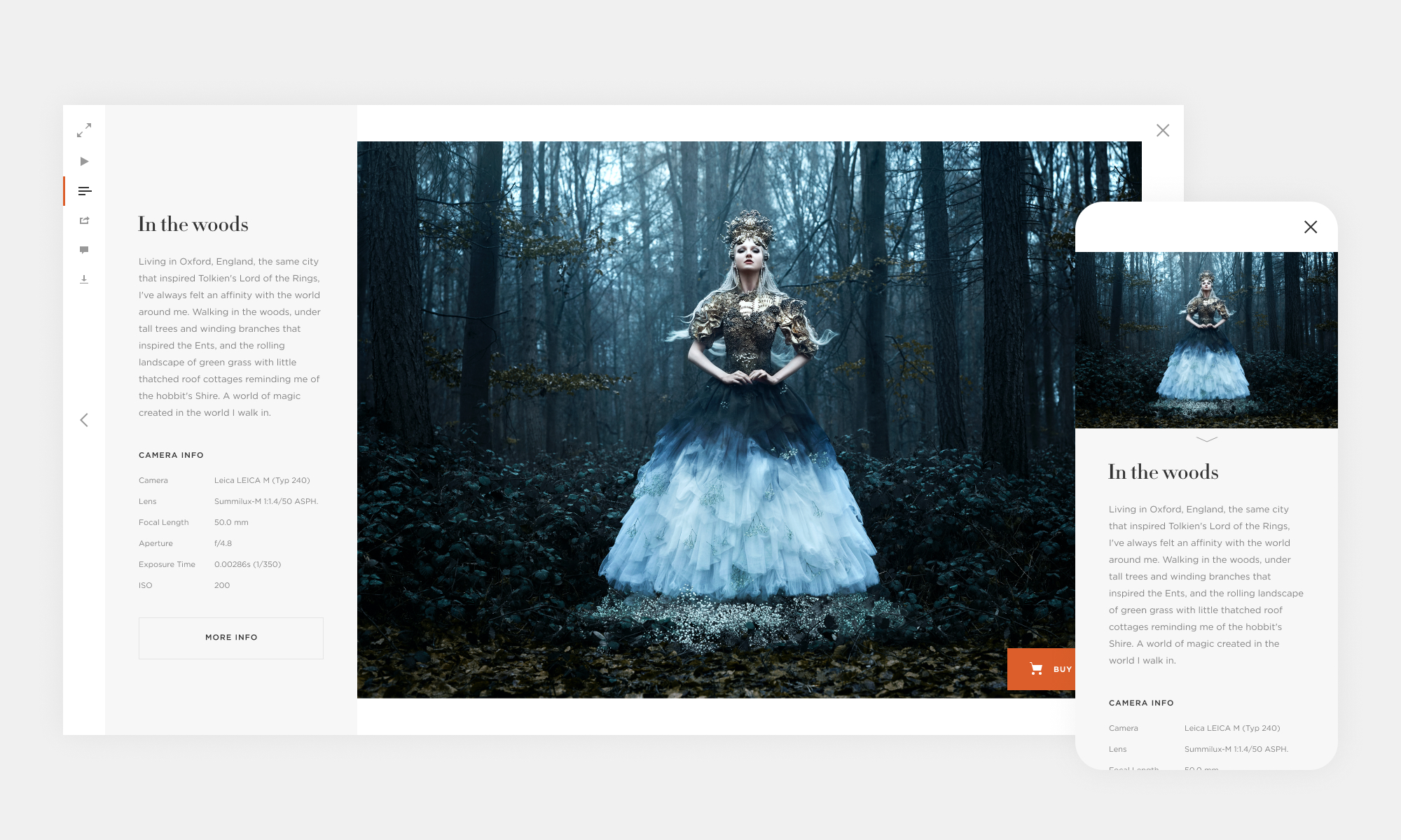
Upon interacting with the photo actions, a panel appears, displaying the photo's information. Greater attention to typography, balance, and the most important camera meta info, was taken into consideration.
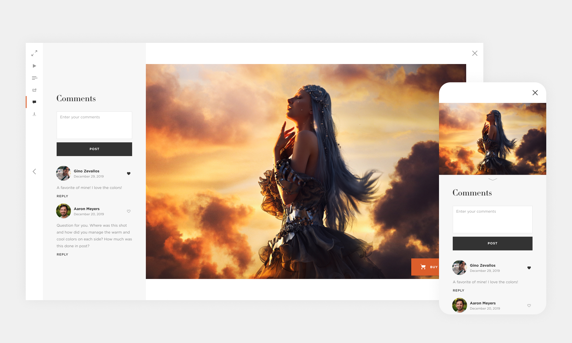
The visual direction is simple with minimalist aesthetics, the focus remains on the photography.
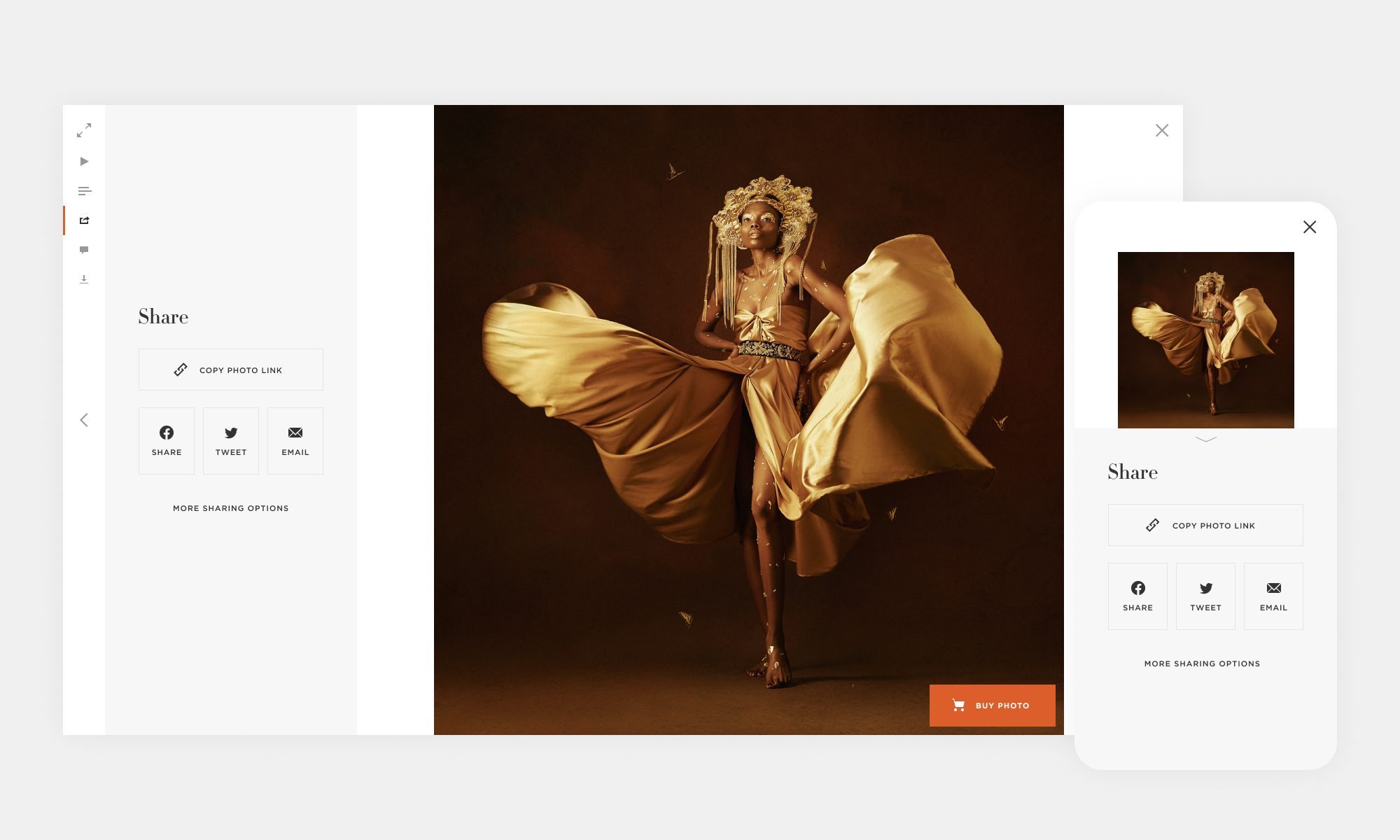
We looked at the sharing data and put the most common sharing methods up front, while more complex sharing methods such as embedding options for blog posting, were put behind a "more" action.
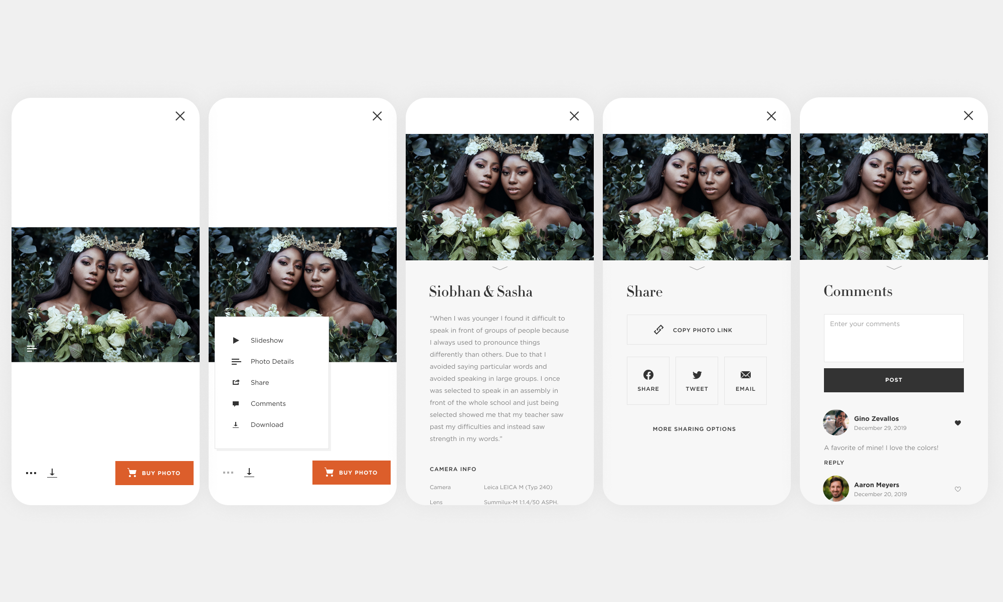
An overview of the mobile lightbox experience.
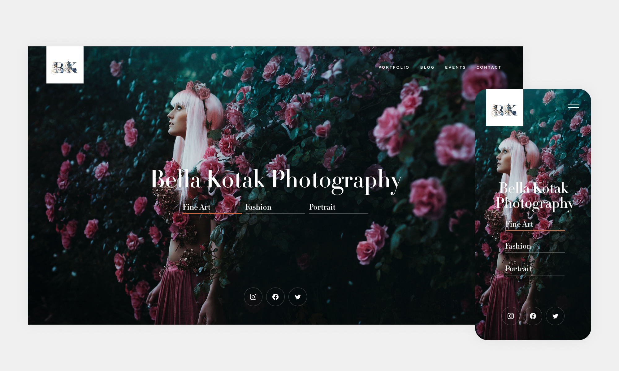
Homepage template design where the background photo changes based on the primary navigation sections. For this example, the background photo cycles through fine art, fashion and portrait photos.
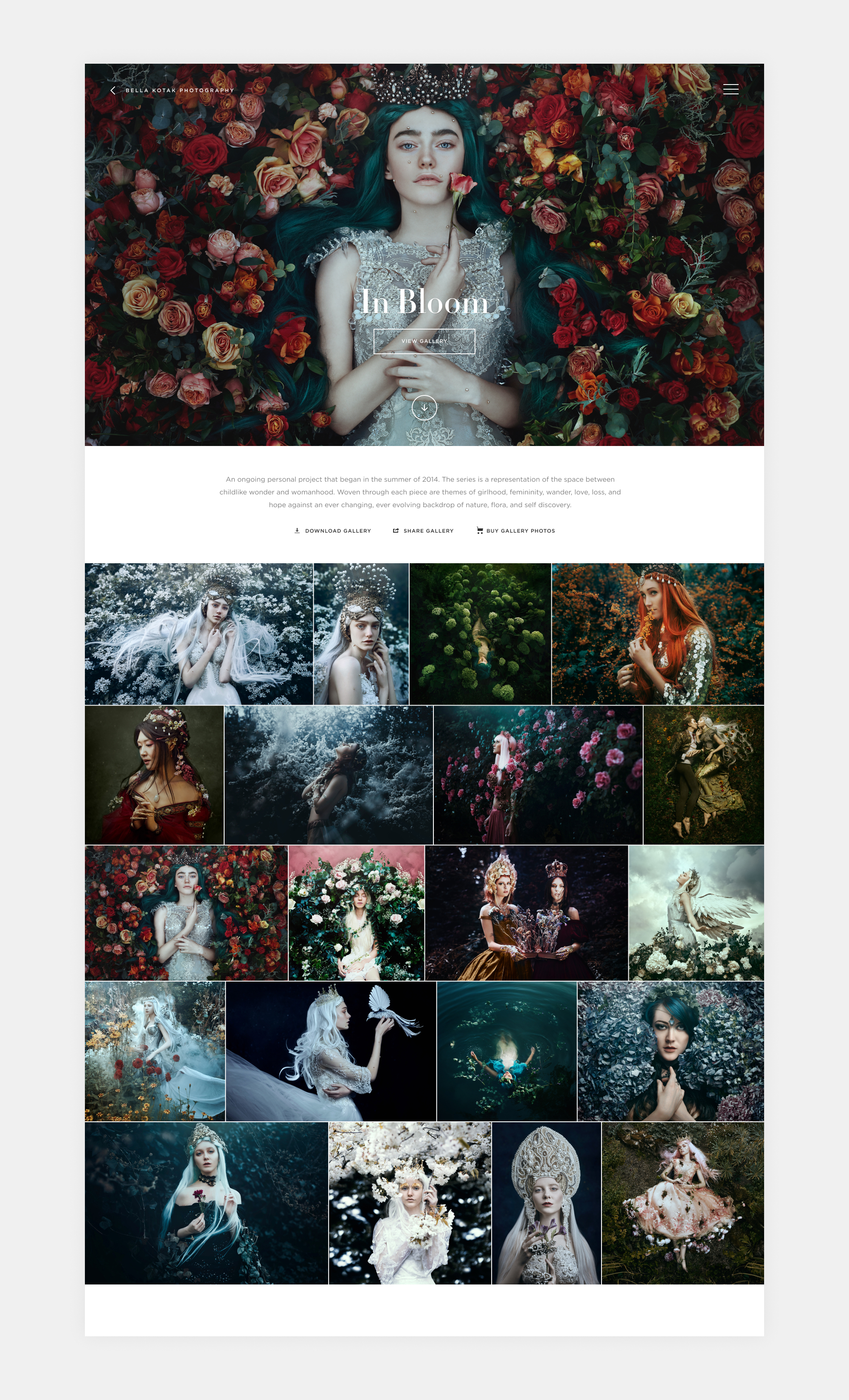
Photo gallery design showcasing the gallery cover photo, an optional description of the gallery, gallery actions and the gallery photos. Photographers usually share their photos with a direct gallery link rather than their homepage link. With that in mind, the design of the gallery needs to be able to stand on its own with the support of a homepage.